Why Do You Use Graphs and Charts?

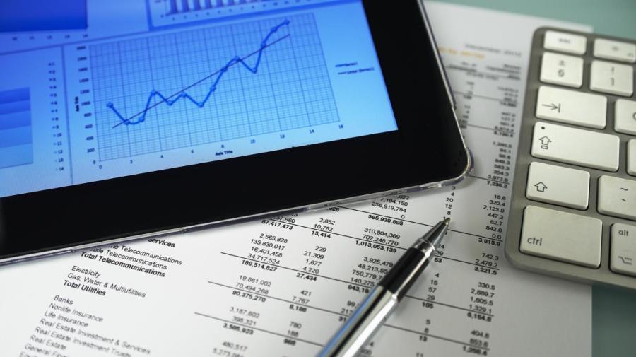
Graphs and charts are used to make information easier to visualize. Humans are great at seeing patterns, but they struggle with raw numbers. Graphs and charts can show trends and cycles.
Statistics helps make data understandable to people. Computers can understand lists easily; humans cannot. While statistical values, like averages and medians, can relay some information, they do not show patterns in a set of data. Charts and graphs do.
Humans are able to detect complex patterns. In fact, humans are often better able to see patterns than modern computer programs. When presented with a graph or a chart, people can often see trends. These trends can be upward or downward, and they can even be cyclical. If the data is presented on a table, however, detecting these patterns is far more difficult.
The aesthetics of information matters as well. When trying to attract investors, people will have more luck if they can present attractive graphs and charts. Visual information matters in media as well, and newspapers and online sites will often take time to present information in an aesthetically pleasing manner. Computers make the process of creating and customizing graphs and charts far easier than even before, which has made them more popular.


